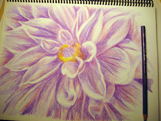
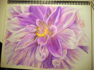
I pulled out my Prisma color pencils a couple of days ago and drew a rose from a photo I took in my garden. It has been years since I've used color pencils to draw anything in a realistic style having really only experimented with drawing grapes that way in the past. Even though it was fun and the grapes looked pretty good, I didn't continue to develop this medium's potential.
Now, after seeing so many (and I mean LOTS and LOTS!) of really amazing drawings by artists who do use them on the sites I've joined, I am inspired to try again. My technique is underdeveloped (I don't really have one - lol!) and I made plenty of 'mistakes' as I went along, but here are a few snaps of the process until the completed drawing scanned.
First I drew the rose out lightly in pencil then began adding a mid pink tone to define the shapes and shadows:
I began adding layers of darker shades of pink and I think that was my first mistake in not choosing all of the colors carefully right from the start as I had to go over the darkest areas a lot before completion (I think people who are really good at this medium don't have to do that but I am not sure yet what is the best approach)
Then I added some leaves and a background to define the edges of the rose and see the perspective more clearly to begin more detailed shadowing and color blending:
This photo is after many more layers of varying shades of pink and purple on the rose. I added a touch of brown to the leaves and stems to give them more definition and another layer of dark green to the background:
And here is the final drawing - I decided to use the same brown from the leaves to add another layer to darken the background further, added a little more green highlight to the leaves and to the rose I added many, many more layers from very light pink to white and dark pink to purple tones to create more definition and depth:
So there it is, my first color pencil drawing of a flower. It was a good exercise and I did learn from it how I might better proceed right off the top for the next one I attempt. I think I overdid it with the layering simply because I didn't have a clearer grasp of the overall shadows' color/tonal qualities of the art as a whole when I started so was correcting that as I went along much more than not.
In other news, my Zazzle store is up and running and can be found here:
http://www.zazzle.com/onlinebydesign
I don't have a lot of designs uploaded to it yet but it sure is fun creating all the products, please visit if you are so inclined - also, if you have your own Zazzle store and 'favorite' mine, I will return the favor ;)
Red Bubble has been fairly active for me this past week, 'Boats In Sunlight' has been featured 3 times since I wrote here last and 'Two Tulips' received it's first (links to feature groups under artwork detail on Paintings page). So far I have only been adding pics of my older artwork to this blog when it gets attention elsewhere, since my intent is to move forward from where I am now in my journey as an artist.
As well as the cultivation of inspiration and motivation, another great thing I enjoy about blogging has been getting to know other blogging artists, some of whom I feel a wonderful like minded connection which is very rewarding and exciting!
Thanks for reading and visiting! :)


