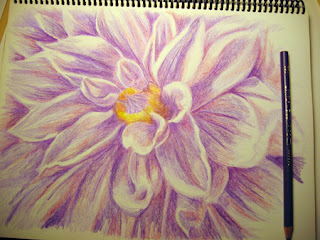
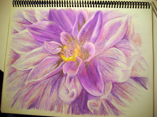
Here yellow has been added to the heart of the flower and I layered over some of the original purple with a redder shade to add some depth to the shadows:
Next a darker purple was layered over to give more definition to the shadows and the petals:
For the darkest shadows I began to add brown and began shaping the petals more with varying shades of pink and purple:
Continuing with the purple, more pink and white was added for the petals' highlights:
This is the completed drawing before cropping:
And this is the cropped copy slightly color adjusted in PS. The original drawing is quite purple, but most of the photos and even the scan kept bringing out the blue. It was hard for me to decide which one I liked best, so I tried to keep it as true in color to the original as possible:
I still find myself layering a lot and many of the drawings I see in this medium that I admire are not so heavy handed. I guess it might just be my pencil style, more like painting in a way, but I also think it is my inexperience that I need to do so much layering before getting the look I want.
This was another fun exercise to do and I'm already looking through my photos to find the next one. Over the past couple of summers I've taken many photos of flowers growing in my garden, mostly macro shots and I have plenty of source pics to choose from. It is good practice and flowers are fun to draw because they are so pretty - lol!
Thanks for visiting! :)


Very beautiful like the other one.
ReplyDeleteThank you Maria! I appreciate you stopping by and commenting :)
ReplyDeleteWow! I kept scrolling down through each new progress picture and thinking it looked awesome already...and then it just got BETTER! That's incredible! I wish I could do that with colored pencils!
ReplyDeleteThank you so much LBOA!! :)
ReplyDelete